One GenAI image; Ten Errors
See if you can spot them all.
When I was a child, “spot the difference” games were popular; you would see two images, and have to notice the subtle differences between them.
(The clock hands are different, the cabinet hardware differs, and so on).
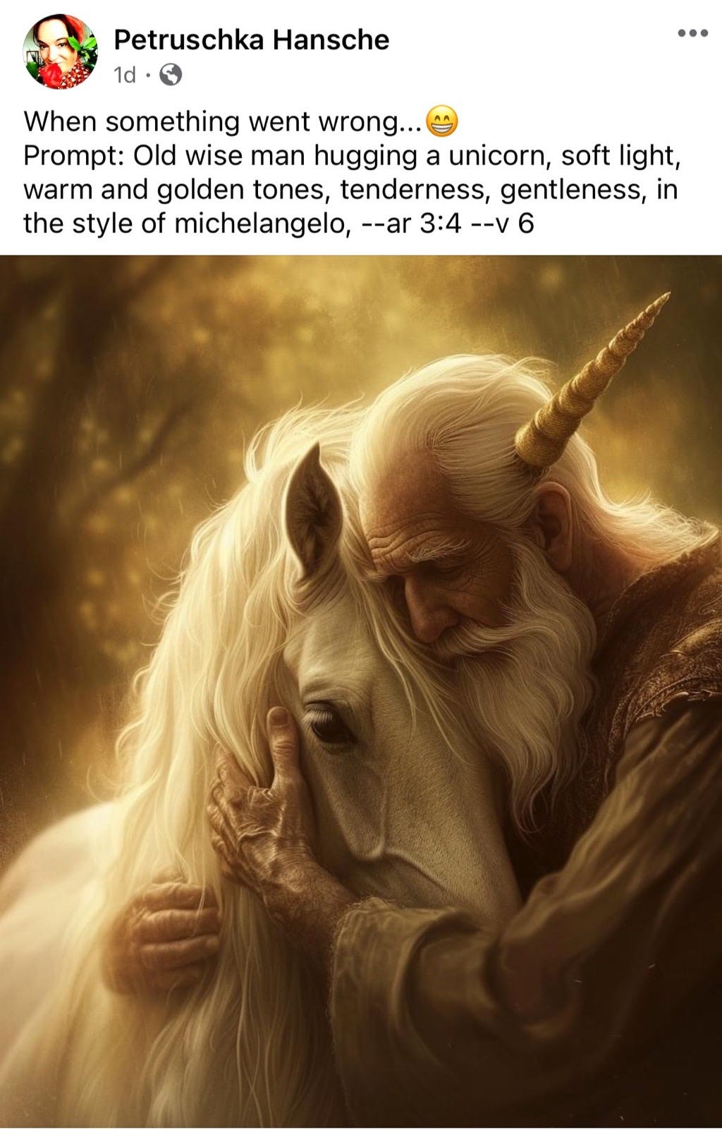
Updating that old game for the modern era, here’s a new one: “spot the GenAI inconsistencies”, inspired by the Midjourney-created image below.
By my count (helped considerably by my sharp-eyed followers on X), there are at least ten ways, many subtle, in which the image neither matches the prompt nor what we would expect from the world.
(If you haven’t already done so, take a moment to see how many you can identify.)
§
Ok, here is a hint: As Dr. Chris McKillop pointed out in a reply to me on X, the image might perhaps have been described as “6 fingered old bloke brutally attacked by unicorn.” (Runner-up, from Martin Rogers,“Old man with impossibly long right arm and 6 digits on left hand being impaled by a friendly unicorn please”) If you didn’t notice the horn through the guy’s head, you weren’t even trying. If you did notice that the hands and arms don’t match, good for you.
Anyhoo, so as not to spoil the fun, I’m putting the full list of errors that I am aware of at the very bottom of this essay.
§
In the meantime, three morals, starting with the most obvious:
It is easier to draw a seemingly coherent image than it is to make sure that the image actually is coherent and consistent with the prompt.
These physical (and in one case conceptual) errors are of a piece with hallucinations and near-plagiarism, too. Hallucinations come from systems exploding data into tiny bits, and then reconstructing them without having a mechanism like a fact-checker to assess the coherence of those reconstructed bits. Near-plagiarism comes from reconstructing those bits in statistically probable ways, without having a mechanism like an originality-assessor to investigate the novelty of the reconstruction.
What unifies all of the above is that current systems are good at local coherence, between words, and between pixels, but not at lining up their outputs with a global comprehension of the world. I’ve been worrying about that emphasis on the local at the expense of the global for close to 40 years, and still don’t see a great solution to it.
The latter would be a great thing for a smart graduate student to think about…
Gary Marcus continues to be struck by the subtle but important differences between human cognition (the main thing he studied in the first part of his career) and AI (the main thing he focuses on now).
Answer key
The ten errors I am aware of
The horn apparently (harmlessly!) running through the man’s head, and possibly at the wrong angle.
The lack of consequent blood or brains etc. on the horn, despite the impalement, with no apparent impact on the man’s health, mood, or motor function.
The man’s right arm appears to be running through the unicorn.
The man’s right arm appears to be unrealistically long.
The hands don’t quite match, fingers on one hand noticeably thicker than the other.
There seems to be hair growing out of the man’s sleeve.
The man seems to have six fingers on his left hand.
There is something off about the unicorn’s twisty ear.
Per Rene Bastien, “There are 2 sources of "natural" light. The sunlight is coming from the back, but the left hand is lit from the left.” (Though, as Robert Scott Kelly points out, this is not entirely uncommon in Renaissance paintings.)
The painting isn’t really particularly in the style of Michelangelo, despite the prompt.


Hi Gary, the errors seem egregious, partly because, when the imagery, text, video... seem correct to us, we tacitly assume they 'knew' what to generate.
But the more bland reality is, they have zero clue about anything at all, even when they compute values that turn out correct (to us).
Stochastic monkeys pounding on loaded keyboards, throwing paint on loaded canvases - with zero understanding of what results...
"The painting isn’t really particularly in the style of Michelangelo."
We can say something stronger than that - it looks like a creepy digital image, not a painting, and absolutely nothing like Michelangelo. Here is what a painting by Michelangelo looks like: https://s3-us-west-2.amazonaws.com/courses-images-archive-read-only/wp-content/uploads/sites/1122/2016/08/16190403/sibyls.jpg
These AI images always look creepy, and it is not just the problems of anatomy and physical space that you have pointed out. An art historian would be able to explain better than me. I think some factors are the excessive detail, unnatural lighting, and the way the textures (skin, hair, fabric, etc.) all look wrong.